Case Study
Exploring Visual Storytelling
The intention behind this self-initiated project is to explore and develop the skill of visual storytelling and extending design narrative and rationale throughout an entire project.
AI Transparency: This project was created without the use of AI. This case study used Claude AI for copywriting assistance.
The brief
Luna Leigh, the (fictional) founder of the cafe bakery, wanted a bold visual identity that captured herself as a passionate baker, but also the beauty of the space.
There also was an additional objective of creating an identity that would represent a clear intention — the revival of the third space.
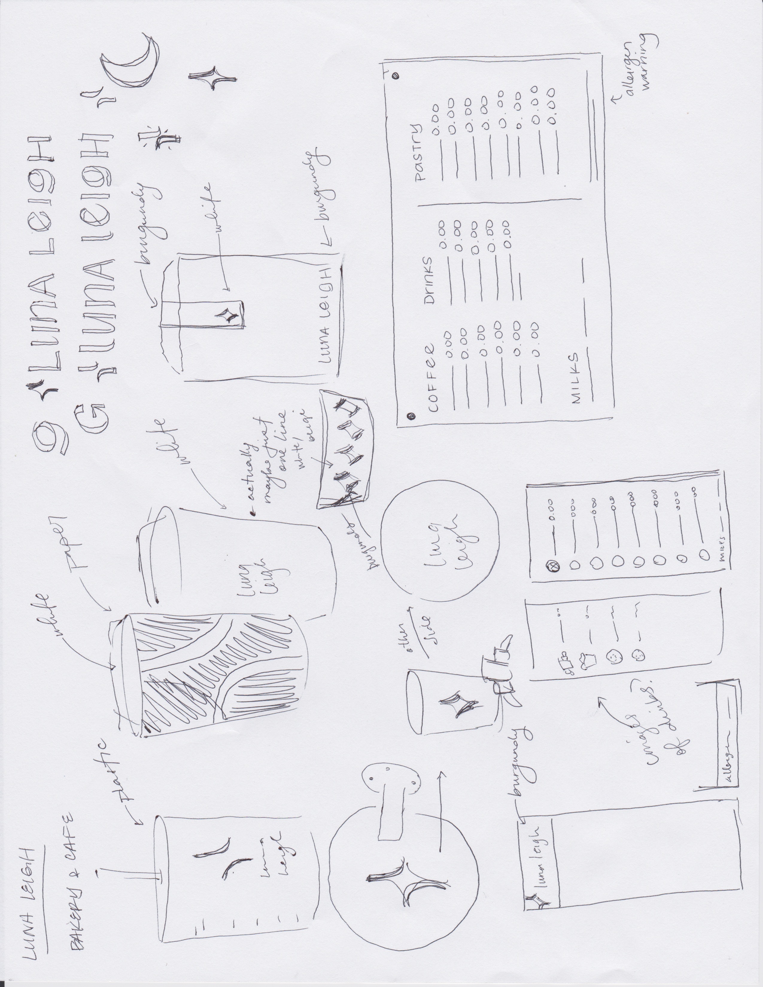
My design process
After establishing the client's the needs, wants and "absolutely-nots" the most important part of my design process is selecting project guiding words.
These (typically three) words are meant to keep consistency, cohesion and most importantly ensure every decision is aligned from start to finish.
Project guiding words for this project
modern, welcoming, functional
Storytelling beyond project guiding words
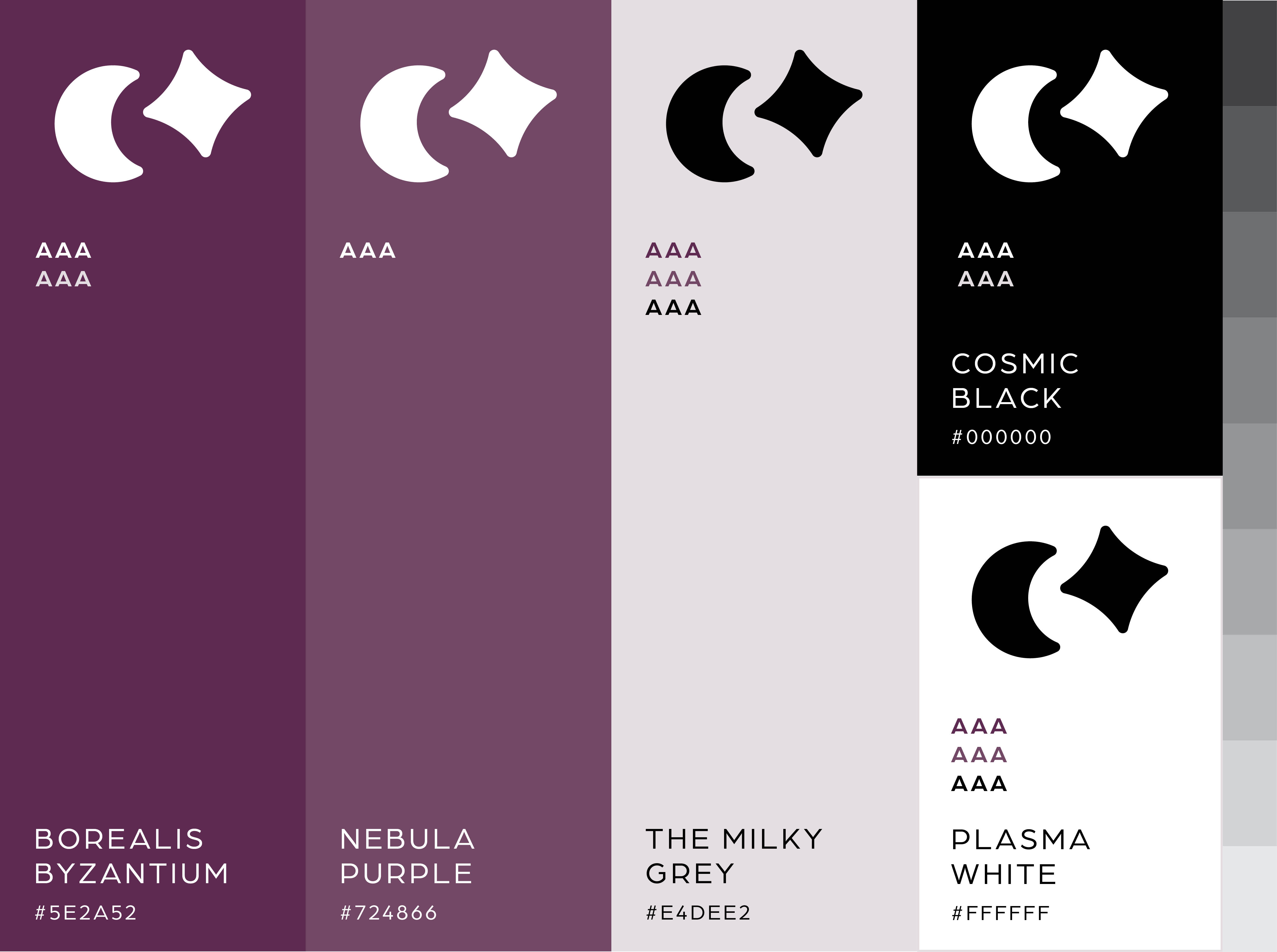
There were two core narratives I wanted to weave throughout the project: the founder's journey and the cafe's mission to revive the third space. This weaving is best illustrated in the logo icon.
Considering what lessons the founder learned along the path to opening their own business, four value pillars were selected to guide the cafe bakery — each represented by a crescent moon.
The idea here is that when these four pillars are successfully achieved and aligned, they create not just a thriving business, but true community. That sense of community, the result of a succesful revival of a third space, is represented with a star at the centre.
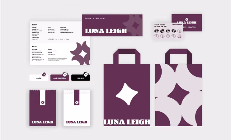
I did my best to ensure these narratives were woven in as many details of the project as I could, including brand colour names, what deliverables were needed, etc.


Lessons learned
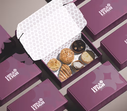
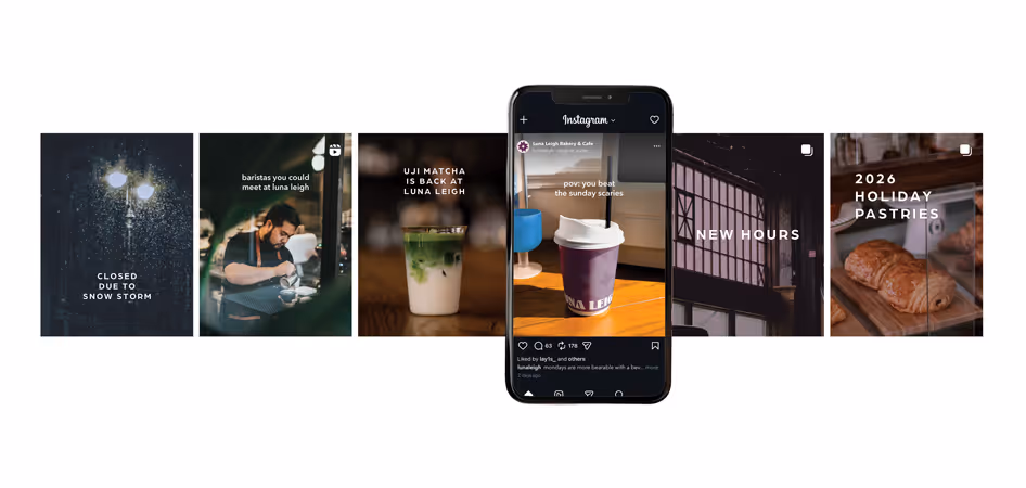
Identity in application